


When planning a home décor project, one of the most important aspects to consider is the impact of Color in each part of the house. Afterall color is the most used and visible part of any home or office where there are walls and ceilings. It is well established that Color psychology plays a vital role in shaping the mood and atmosphere of any space, whether at home, in an office, in a bedroom, or a meeting room. Whether designing a cozy living room, a vibrant kitchen, or a serene bedroom, understanding how colors influence emotions and behaviors will take the investment worth your time and money. This blog aims to explore and bring to you the principles of color psychology in home décor.
How does Color Psychology work? How do colors affect mood?
Color psychology is the study of how different hues impact human emotions, thoughts, and behaviors. Various colors can evoke distinct feelings, and this knowledge is used strategically by professional home designers and interior decorators when designing homes and offices. For example, a group of warm colors such as yellow, orange, and red are known to be energizing and can evoke feelings of warmth and happiness. On the other hand, the group of cool colors like purple, blue, and green are known to have a calming effect, promoting relaxation and tranquility.
Research suggests that colors can even affect physical responses such as heart rate, blood pressure, and energy levels. For example, blue is often used in bedrooms because of its ability to lower heart rate and encourage restful sleep. Similarly, bright colors like yellow are frequently used in kitchens and dining areas and the like to stimulate conversation and enhance appetite.
Warm Colors and a source of Energy and Vibrancy
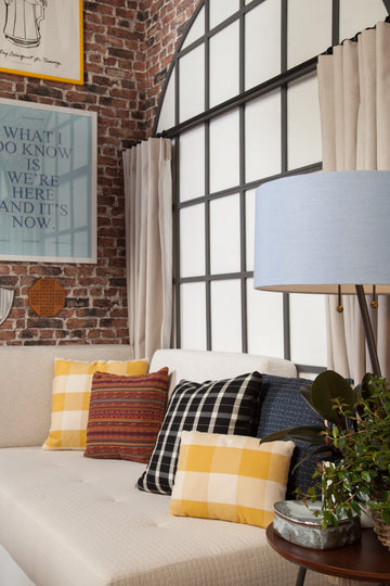
When decorating with warm colors, think about how you want the space to feel. Red is associated with passion and energy, making it an excellent choice for bedrooms or living areas where you want to encourage conversation and emotional interactions. Adding Sunbrella cushions in bold shades like Canvas Terracotta can provide the perfect pop of Color to bring warmth to a space.
Orange and yellow, too, are excellent for creating lively and cheerful environments and are ideal for spaces where energy is required, such as kitchens or family rooms. The right balance of these warm tones can make a room feel cozy and welcoming.
Tip: Balance warm hues with neutral tones like beige or white to prevent the space from feeling overwhelming. For instance, a vibrant yellow couch with neutral-colored throw pillows can achieve the perfect harmony.
Cool Colors create an abode of Calm and Serenity
The Colors of Relaxation
Cool colors like blue, green, and purple are associated with calm, relaxation, and serenity. These are ideal for bedrooms, bathrooms, and spaces where you want to experience peace. Blue, in particular, is known to reduce stress and lower anxiety, making it a popular choice for sleep spaces. Fabrica Kraft's Sunbrella Spectrum Peacock cushions in deep blue can introduce a soothing element to your seating.
Green, the Color of nature, is an excellent choice for balance and tranquility. Incorporating green in the form of cushions, throws, or rugs can bring a touch of the outdoors into your home. It's particularly effective in home offices or living rooms, creating a refreshing and rejuvenating vibe.
Neutral Tones are about Elegance and Sophistication
The Perfect Backdrops
Neutral tones such as white, gray, and black are essential for creating a balanced, sophisticated look. These colors offer flexibility and can be used in any room as a backdrop for more vibrant accents. A grey sofa, for example, provides a sleek and modern base for colorful velvet cushions and throw pillows, while black accents like leather cushion covers add a touch of elegance to the space.
White, often associated with purity and simplicity, is ideal for creating a clean and open feel. It's frequently used in modern and minimalist interiors to maximize the perception of space. Pair white walls with neutral-tone cushions for a minimalist look that exudes calm and order.
Pro Tip: Neutral colors are also highly versatile when decorating seasonally. You can easily change the look of a room by swapping out cushions and accessories in different hues without needing to repaint or replace large furniture items.
Combining Colors to Creating a Harmonious Modern Look : Monochromatic, Analogous, and Complementary Schemes
Creating a harmonious color palette involves balancing different hues to achieve the desired emotional effect.
There are three main color schemes to consider when designing your house:
Monochromatic Color Scheme: This implies using shades of the same Color to create a soothing, cohesive look. For example, layering different shades of blue can create a serene, beach-inspired vibe.
Analogous Color Scheme: Combining colors that are next to each other on the color wheel, such as blue, green, and teal, creates a calm and harmonious feel. This is ideal for areas where you want a relaxed atmosphere, such as bedrooms or reading nooks.
Complementary Color Scheme: Using opposite colors on the color wheel, like blue and orange or yellow and purple, creates high contrast and adds energy to the space. This combination is great for social areas or spaces where you want a bold, dynamic look .
For instance, combining Sunbrella cushions in complementary colors like blue and orange on your patio can create a visually striking, vibrant, inviting outdoor area.
Enhancing the Impact by Adding Fabrics
How Texture Plays a Role in Mood
Fabric textures, in addition to Color, can significantly impact the feel of a room. Plush fabrics like velvet are associated with luxury and comfort, making them a popular choice for living rooms or bedrooms where coziness is essential. A deep-colored velvet cushion can instantly make a space more luxurious and inviting.
Leather, on the other hand, adds a sophisticated and timeless element to your décor. Leather cushions provide durability and are perfect for creating a more structured and refined look in studies, offices, or formal living rooms.
Practical Ways to Incorporate Color Psychology
When using color psychology in your home décor, start small by introducing colors through accessories like cushions, rugs, or artwork. This allows you to test the effect of different hues without committing to major changes like painting walls or replacing furniture. Gradually layer colors and textures to create a cohesive, balanced look that reflects your style.
Once you understand the psychological impact of Color, you can transform your home into a space that not only looks beautiful but also feels perfect for you. Whether seeking to energize your living room, calm your bedroom, or create a welcoming outdoor area, Fabrica Kraft's home décor products can help you achieve your design goals.
